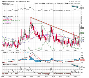
The markets have been on quite a wild ride lately, and the volatility index has made it clear how painful the situation is for everyone. The downward moves have been sharp and deadly, seriously threatening a six year bull run; much of the damage has occurred over the last few days. Interestingly, markets were so close to all time highs just a week ago (it was less than 1% away!), but that record seems an eternity away now. The market giveth, the market taketh away.
Volatility Index Chart
 The chart of the VIX is completely “off the charts.” Given the rise of put protection and the increase of short term fear, it makes sense the market would tumble. And don’t forget the uncertainty over the economy, China, Fed policy and other scud missiles that have yet to hit their targets.
With a move above 40, the VIX is in rare territory. Even the move over 50 on Monday has only been seen on a few occasions. At this point, option premium is high due to the extreme implied volatility. I suspect more wild and extreme action to occur, so time to buckle up. We’ll walk through the monthly chart to put the VIX into context.
Volatility Index Chart Analysis
Take a deeper dive into the chart action (NYSE: VIX) and learn how to read the technicals and my analysis as I mark up our chart of the week.
Love what you’re learning in our market analysis? Don’t miss a single video! Get the latest chart action delivered directly to your inbox every week as Bob breaks down stocks to watch and potential trade options!
About VIX
VIX is a trademarked ticker symbol for the CBOE Volatility Index, a popular measure of the implied volatility of S&P 500 index options; the VIX is calculated by the Chicago Board Options Exchange (CBOE). Often referred to as the fear index or the fear gauge, the VIX represents one measure of the market’s expectation of stock market volatility over the next 30-day period.


