On the last day of October trading, I did some SPX 500 analysis. The daily and monthly charts have a lot to tell us about the short-term and long-term trends. Here’s what I found.
SPX 500 analysis: daily chart is bearish
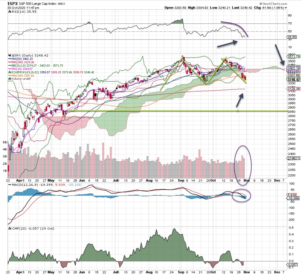
With panic in the air, the daily chart is rolling over hard. The VIX is at 38, and the put/call ratio is rising. When this happens, it’s time to lower expectations. If you thought we’d see a bounce on the 200 ma to 3130, you may want to look a bit lower to 3080 or so.
On the other hand, if the markets get deeply oversold (a distant possibility), we could see a bounce up to 3200. In that case, many traders would likely step up to buy at that 200 ma test. Frankly, that’s too early for me.
Let’s look at some other technical indicators: The MACD has rolled over, the RSI is poor (just look at that steep curve downward!), the cloud is red and the money flow is bearish.
The most ominous sign is the M pattern, a classic bearish pattern that shows a breakdown from support. Volume trends are elevated, and while buyers will eventually step up, I have no idea how strong that bounce might be. It’ll take several weeks – even months – to repair the damage of the last few weeks.
Monthly chart remains bullish
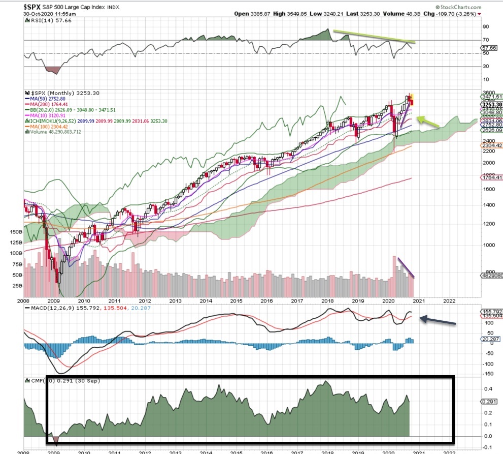
The monthly chart is still bullish, and it will stay like that until the MACD rolls over. Money flow has been very strong since 2009, so what we’re seeing now may just be a minor blip on the screen. The 50, 100 and 200 month ma are strong, with the 20 month coming in at 3050. Based on this chart, there is no reason to be bearish over the long-term.
Bottom line: The daily chart shows some short-term turbulence, while the monthly chart shows a long-term trend that’s still bullish. As is often the case lately, play it lightly, hold plenty of cash so you can scoop up opportunities and protect your portfolio with index puts.


