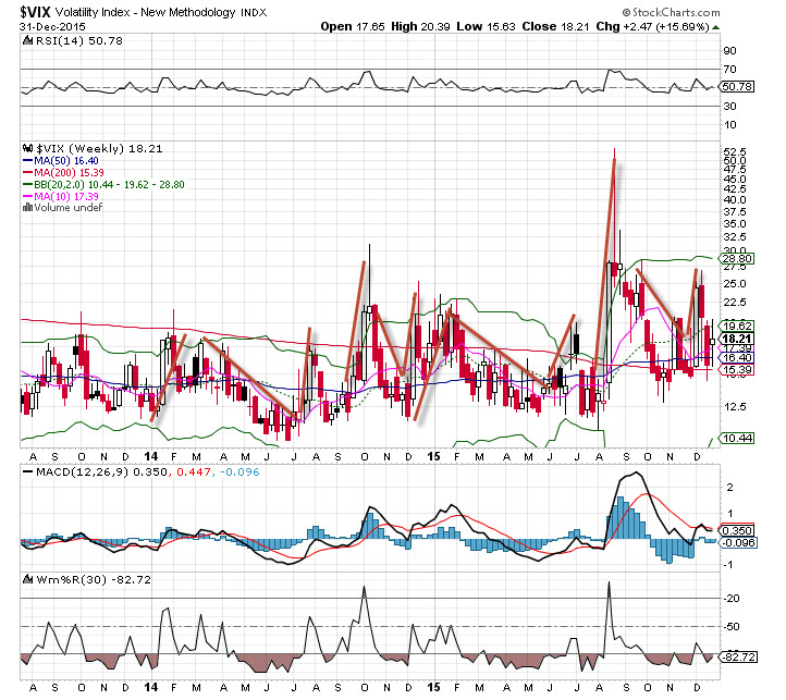
The VIX is an indicator that measures market volatility, and it has had its fair share of ups and downs since 2013. As we see from the chart below, the range has been very wide, moving from the 10’s up to the low 50’s. But what is interesting on this daily chart is the similarities between 2014 and 2015. Strikingly, the VIX patterns are similar in time and price. A definite pattern of market behavior seems to be repeating here, and while each moment is different, the psychology of markets never changes – it is always based on fear and greed. 
Here’s the volatility pattern that I see in the charts:
Fear seems to rise to begin the year before falling sharply in February as markets start to rally into the spring. A late summer pop in volatility ensues, followed by a massive surge. Then the markets pull back, rally into Thanksgiving, and towards the end of the year, volatility rises as market selling pressure intensifies. The VIX finally settles down during the last two weeks of trading, as traders show little interest.
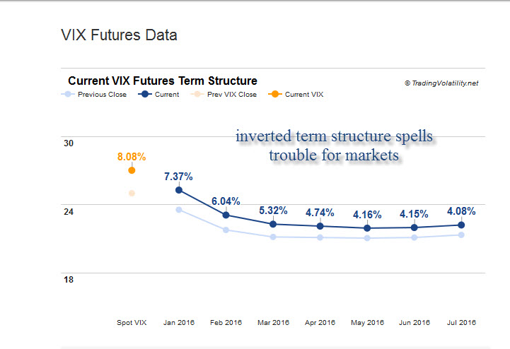
Longer term trends of the VIX are still lower, but many are expecting more volatility in the year ahead. Certainly the VIX futures are reflecting this sentiment (see the chart below from December 31, 2015). What seems to give rise to volatility is uncertainty – after such a long period of market advancement, when will it end? Bets are constantly made that the next fall is going to bring the markets crashing down. However, those bets have yet to be paid off. 
Is this a formula to use for 2016? I’m not sure, but I would not be surprised to see the pattern repeat once again.After all, I am a technician who relies on charts and patterns to trade the markets. If January sells off as it has the last two years (down 5% or so in 2014 and 2015), then I’ll be looking for that big rally to happen in February, as it has in the past two years.
Copyright: pakhnyushchyy / 123RF Stock Photo


