Sometimes obscure trend indicators can help you analyze a chart more clearly. We take at three of them to confirm what we’re seeing on the SPX500 chart.
Every now and then I like to explore different indicators in my technical toolkit to see where I can find an edge. It’s true that many indicators provide the same or very similar information, just in a different format.
Just be careful about using too many indicators. You can quickly enter information overload territory!
Three obscure trend indicators I like to use
Today, we will talk about three of the more obscure indicators I like to use: a trend indicator, a money flow indicator, and a volatility indicator. Used together, they help us confirm what we’re seeing on the SPX 500 chart.
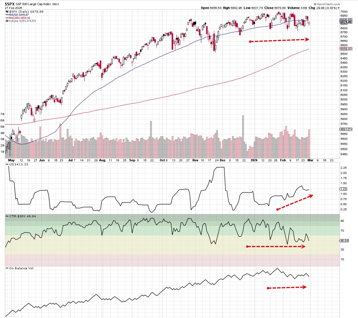
Below is the SPX 500 chart from Friday, February 27. It moved sharply upward beginning in May 2025; that nice bullish run lasted until the end of October. Since then the market has been rangebound, and the chart has been a choppy mess with some large spikes up and down.
That often happens during a time of indecision. Is the market overvalued? Are lower rates on the horizon? What about an economic boom?
Those questions are not for us to answer. We just need to know that when volatility is starting to ramp up, prices move in wider ranges. Traders and investors hate that uncertainty, so there’s always the risk of a sell-off.
The chart is also telling us that prices are in a no-trend state. There are no higher highs and higher lows being made. Price is just bouncing up and down.
So what can we expect going forward?
Chande Trend Meter
The Chande Trend Meter (pane 3) has been holding pretty steady near the 50 level. This indicator shows us the relative strength over 14 days versus the standard deviation short term price channel breakout. When this indicator is in the 20-60 range, the index/stock it’s analyzing is stuck a flat or weak downtrend.
Ulcer Index (UI)
The Ulcer Index (pane 2) measures downside risk and sends strong signals if volatility is rising. It got its name because its readings could give you a stress-induced ulcer.
When volatility rises, so does the UI. It is currently at 1.23 for the SPX 500 and rising, which tells us traders and investors are getting worried but not so worried that they’re hitting the sell button.
(Note that the UI is a lagging indicator and tells you how risky the index/stock was in the past.)
On-Balance Volume
On-balance volume (pane 4) is one of my favorites. It was created by Joe Granville more than 40 years ago to predict changes in the stock price using volume differentials based on buying/selling pressure. Its readings can help you anticipate price moves.
The indicator is currently flat to down, much like the Chande Trend Meter.
What the three indicators are telling us
The SPX 500 is not only range-bound, but highly volatile and trying to figure out which direction that next trend is going to be. Yes, this is simple analysis, but it importantly confirms what we were already seeing on the chart.
Use these and other indicators to support your thesis, and you’ll be on your way to becoming an excellent chart analyst.
comes to selling!