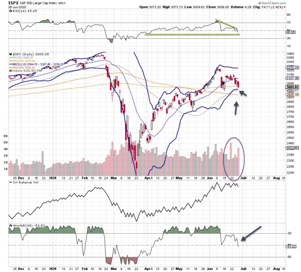
While the markets have been living the good life for the better part of three months, it appears some downside is coming. The more time I spend with the SPX 500 chart, the more I think that something is brewing under the surface.
It is perfectly normal for a correction to occur during an uptrend. This current trend has been held up by a staggering amount of liquidity. Can that continue? Sure it can, but eventually there will be consequences.
However, your job is not to judge or punish the markets. Your job is to identify when the conditions warrant bullish trades and when conditions warrant bearish trades. No matter what, buy some protection in the form of index puts, even when markets are rising. Like car or homeowner’s insurance, you don’t always need it. Last Wednesday or Friday, you definitely needed it.
Anyway, let’s dig into the SPX 500 chart.
SPX 500 chart signals some downside is coming
Current market behavior, which we can see in the above SPX 500 chart, shows a bit more downside is coming. Two signals should have the bulls worried: a few sharp drops on heavy turnover and a new, lower high.
On Friday, price stopped just short of the lower bollinger band, which is often where veteran traders will start buying. The on balance volume is churning at a high level, indicating that institutions are selling. Other indicators have started to roll over, like the RSI and %R. While the market selloffs were concentrated and painful last week, I don’t see a turn higher happening – not yet anyway.
Earnings season is coming up, and it may provide some good trade opportunities. Remember, you don’t want to be short during earnings season. If the price action is weak and breaks through support (indicated by the arrows on the chart), you will hear plenty of conversation about the bears have regaining control. For now, the SPX 500 chart is waving a yellow flag warning for the bull camp.


