Since the middle of June, we have seen some remarkable market action, all of which was driven by volatility. Let’s do a little volatility analysis and dig in to understand what’s happening now, what the chart patterns mean, and what to expect over the next couple of months.
Volatility and the Brexit
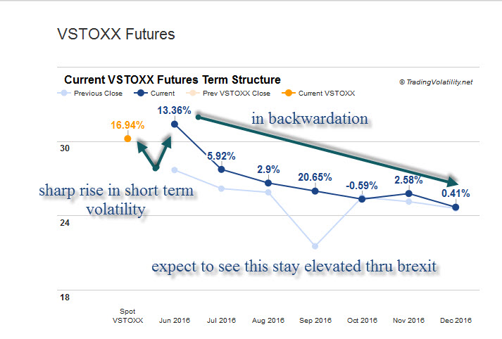
Volatility started to kick up mid-month as the Brexit vote came closer. European markets reacted quite negatively; the VSTOXX term structure showing panic-stricken investors were lining up. What started out with a rather shallow dip in volatility morphed into a near-catastrophic drop following the Brexit decision, leaving many to wonder if they should have followed the “sell in May and go away” maxim. 
In mid-June, the cost of protection was still rather inexpensive – even after the Fed committee expressed deep concern about the fallout from the upcoming Brexit vote and downgraded the economy.
But when the Brexit happened, markets went into a tailspin. On Friday June 24, we saw a spectacular drop lower to the tune of 600 Dow points; the following Monday was nearly as bad. By the end of trading, more than 1,000 Dow Industrial points had been lost in two days.
When the markets gapped lower on these two days, it was difficult to engage in the action. Plus, anybody who had long positions were likely either stopped out or so disgusted they just tossed their stocks to the side. Yet, when the pain was at its greatest, the markets turned – quickly. Tuesday saw a strong close, followed by three more solid trading days. By Friday, July 1, the markets had fully recovered and the Brexit shock was over.
Psychological damage could linger
If you blinked, you missed it. We’ll have to see what the next week or so brings to understand whether there is enough psychological damage that the markets will move to lower levels. The gaps up last week made it hard to gain enough confidence to get on board, leaving many traders behind when moves were made in overnight futures. The damage is compounded when you’re scrambling to get back on board. At that point, you’re late to the party and losses occur again when the next move down happens. And then you’re stuck in an ugly rinse-and-repeat cycle.
V pattern appears in SPX 500 chart
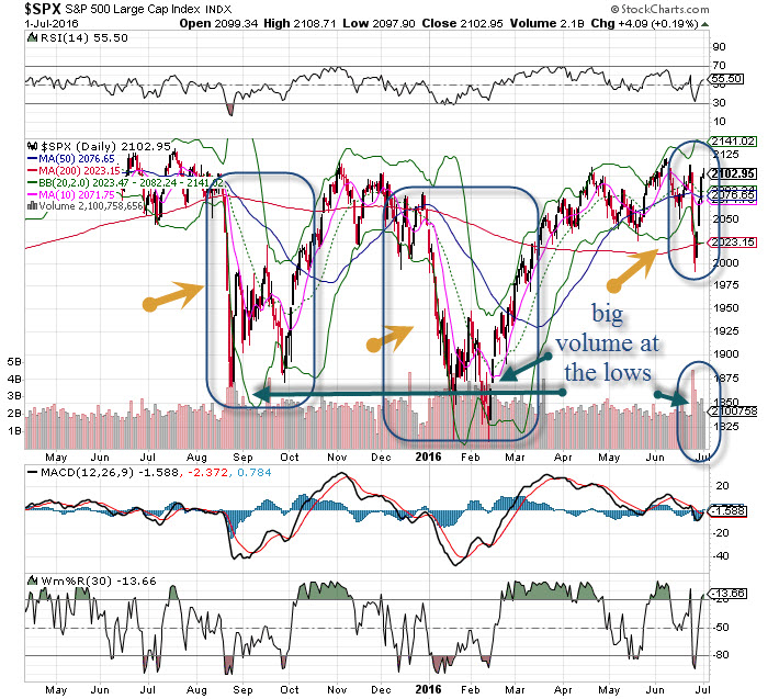
The SPX 500 chart clearly shows a V pattern, something we have not seen since late 2014. If you look back over the past year, you can also see the W pattern appear – twice.  V-shaped bottoms are rare and far less desirable than a W-shaped pattern, though both of these patterns are indicative of violent up/down action marked by moments of terror and unbound excitement.
The current V could turn into a W – so what’s it going to be? If we look to clues from the prior W patterns (January and February of this year and September and October from last fall), we can see the move down was prolonged and deep – far different than this recent drop that lasted only two days.
The bottom line
While a W is possible, we are likely headed for a rangebound market once again, bracketed to the upside at 2115 and 2040 on the downside.


